We've done new designs for clients and we've seen their sales triple! Yes, that happens and we love it!
Why does it happen?
It's simple and it's a strategy you might be able to use on your current website without much hassle.
We're geeks, so yeah, we have. Hick's Law states:
The time it takes to make a decision increases with the number and complexity of choices.
In other words, "less is more" right?
Sometimes we go through a design process with a client and they want to move everything up into the header and have all kinds of buttons there. We very nicely explain how that's not good and then they understand. You have to keep things clean or people will find the website's too complicated to use and leave.
If there are too many choices, that can also scare them.
For example, in a shopping cart, if you offer 10 versions of "Widget A" they're going to wonder which one to choose but if you offer 2-3 versions, that's easier and you'll sell more.
 This also works with design. You want good call to action (CTA) buttons and links but not too many. You need a main call to action.
A call to action is simply asking someone to do something. For example:
You call to action buttons should match what people might want to do when they get to your website.
For example, they might be at your website to find your phone number. Good! Don't hide it. Make it easy to find but maybe that's not your main call to action. Maybe it's "Contact Us" because on that page, you're offering multiple ways to contact you like via phone, email, a form, or showing up at your physical location. Thus, a "Contact Us" button should be the main call to action and stand out more than the phone number. Both can be there but by putting more weight on one of them, you're telling your website visitors what you want them to do. The "Contact Us" button covers both contacting you by phone and other ways, so that's why it's weighted more.
Have you ever seen a landing page? It's basically a page full of text and it's really just about one thing. There's usually also really just one thing to do when you get to that page - Hick's Law in practice.
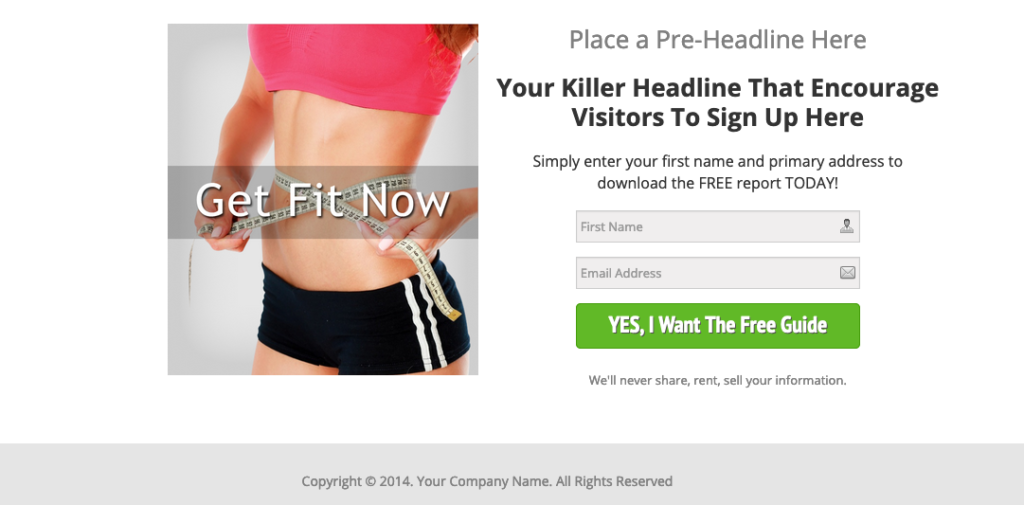
Here's an example of a type of landing page called a squeeze page you may have seen in the past:

Of course, you need a killer headline and some marketing copy added but you get the point. As you can see, there's just one thing to do there - sign up for the offer (lead magnet). It's do that or leave, basically.
These pages work well with Pay Per Click (PPC) campaigns. You're buying those clicks, so when people click on your ad (which should match what you're offering), there's just one thing to do there. Choices are less, right? So what do most people do? They enter their email and subscribe to get the giveaway. They do what you want them to do because that's the only choice you're giving them.
Take a good look at your website and count how many call to action buttons, links, and statements you have. How many look like main calls to action? Are there more than one? That might be fine but if they're too close together, then you're just confusing people. Are there not enough? That could be one reason why nobody is taking action.
Next, start testing!
Change things up.
Add more CTAs or take some away, then see what happens.
Move some around. Put more weight on some and less on others.
Don't do too many changes at once because if your conversions increase, you won't know which one worked. Just do one thing, then wait a week or two and do another. Watch your stats and see if anything stands out as a winner.
 At Webstix, we don't leave this kind of thing to chance. We have certified experts on staff who know design inside and out. They understand the user experience down to the pixel level. We've built nearly 1,000 websites and we've learned quite a bit during that process. Every bit of knowledge we've gained is put into every new project we develop - and we've been doing it since 2001!
We have many clients who have seen a bump in traffic, sales, and leads by doing a fresh redesign and by using the same amount of traffic. Then, the cool thing is, we build their websites faster and better, which Google likes, and they get more traffic, too, since the websites rank higher!
Our industry changes lightning fast and we are keeping up. We're definitely not "bleeding edge" because we understand our clients' businesses are at stake but we use technology that is proven to work. Every advantage we can give our clients goes into every new website design project we go through. There's not a better time to get a new website than right now.
If it's time to "level up" and finally get ahead of your competition, then we're with you. We really like those kinds of clients.
Contact Webstix today and let's talk!

